WIREFRAMES
Unsung Heroes of the Design World
Kicking off a new project can be intimidating—where do you begin? While it is tempting to jump straight into the more exciting elements like imagery, typefaces, and colors, it is important to start with a solid plan—or wireframe—for your site, which will help you to quickly identify problems with page structures or user experience. Much like an architect’s blueprint, a wireframe ensures each space is designed with a purpose. Careful, logical planning in the beginning will result in an easily navigable environment and allow you to focus on furnishing your space down the line.

Simplified visuals
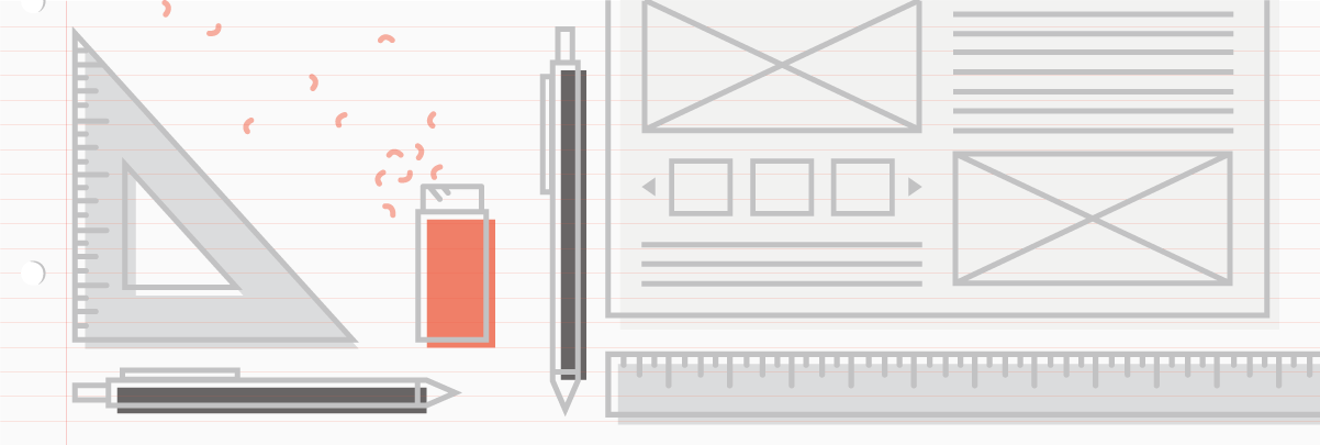
Wireframes are designed in black and white using a limited set of fonts, with gray boxes to indicate imagery and icons.
Using these simple shapes and colors helps to zero in on the foundational elements of a page, like its architecture and hierarchy. When we break it down to the most basic elements we can focus on the user experience and produce multiple iterations quickly, allowing the creative team and the client to provide feedback earlier in the process and resulting in a more successful outcome for the final design.
Responsive design
With the vast array of digital devices on the market today, it’s important to design a wireframe that can successfully transition between multiple screen sizes to ensure that your page structure works and provides the best experience possible.
Learn more about responsive design »
Wireframes are design
It’s easy to forget this when we get excited thinking about the more glamorous side of design—i.e. the eye-catching features, custom animations, dramatic colors, and flashy typefaces that are undoubtedly an important part of the process—but all of these elements should serve the main purpose of the site, which is to provide a user with clear paths to reach their desired information. Combined, the structured information and visual beauty of a website should make it both a work of art and a functional tool.